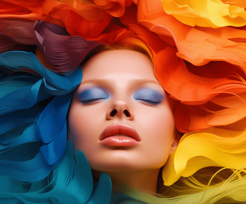
Color psychology is the study of how colors affect human emotions, behavior, and perceptions. It explores the impact of color on human behavior, our mental state and physical reactions.
For years, marketers have understood the power of color psychology in marketing and branding their products and services. Colors can evoke specific emotions and influence the decision-making process of customers. A great example is the color red, often associated with passion and excitement, used by Coca-Cola to create an emotional connection with their audience.
Understanding the psychological and emotional impact of different colors can be a powerful tool for brands to create a strong brand identity and engage customers. Brand color consistency throughout your web design, graphic design, and traditional and digital marketing efforts will be vital for recognition, loyalty, and capturing the attention of new customers.
Understanding Color Theory
Color theory is a complex concept that involves an intricate understanding of color relationships and the emotions they evoke in us. Simply put, color theory is the science behind how colors interact with each other and the impact they have on our feelings and perceptions. Colors and color preferences can influence our moods and reactions, affecting everything from the way we shop to the way we behave.
From warm yellows that energize us to cool blues that calm us, color theory plays a pivotal role in branding and marketing. For businesses, understanding the importance of color theory is crucial to creating a successful brand that resonates with their audience and elicits the desired emotional response. By using strategic color combinations, marketers can effectively convey their brand’s message, cultivate desired emotions, and stand out in a crowded marketplace. This will be essential for converting pages of your website, your logo, and more.
Primary and Secondary Colors
When it comes to art and design, knowing about primary and secondary colors is essential. Primary colors are the building blocks of all other colors — red, blue, and yellow. These colors cannot be created by mixing other colors.
However, by mixing these primary colors in a specific way, you can create secondary colors such as green, purple, brown, and orange. It’s important to note that secondary colors will always consist of two primary colors. For instance, green is made by combining blue and yellow, while purple is created by blending red and blue.
Understanding the relationship between primary and secondary colors is key to creating a balanced and harmonious color palette. Whether you’re a painter or working in graphic design, this information is critical to know and master.
Color Temperature
Color temperature in branding and marketing plays a big role in communicating the intended message and evoking certain emotions in the viewers. Color temperature refers to the warmth or coolness of a color, with warmer colors having a red, orange or yellow tint, and cooler colors including blues, greens, and purples.
For branding and marketing purposes, color temperature can be used to convey feelings of trust, excitement, serenity, or even urgency. For instance, warm hues are effective in conveying warmth, excitement, and passion, making them ideal for branding of food and beverage products.
Meanwhile, cooler hues such as blue and green are associated with serenity, calmness, and trustworthiness, which make them suitable for branding products and services in the healthcare and finance sectors. Understanding the impact of color temperature on branding and marketing can help businesses to select the best color schemes to communicate their intended message and achieve their marketing goals.
Color Harmony
Color harmony is an essential component of any form of design, and understanding it is crucial to create a visually appealing and cohesive piece. This concept refers to the art of combining colors to create a satisfying aesthetic that brings balance, unity, and emotional resonance to a composition. It is composed of various elements, such as complementary colors, analogous colors, triadic colors, etc., and it provides the designer with a vast array of possibilities to explore.
However, mastering color harmony requires practice, patience, and a keen eye for color, but once achieved, it can elevate a design to a new level of creativity and beauty. Whether you are creating a logo, a website, an advertisement, video production, or any other design, understanding and applying color harmony can make all the difference in creating a memorable and impactful composition.
The Impact of Color on Branding
Color is more than just a visual component of branding – it has a psychological impact on consumers’ perceptions and emotions. Different colors can evoke different feelings and associations, from the energy and excitement of red to the trust and reliability conveyed by blue. Companies spend countless hours and resources researching the most effective color combinations for their logos and branding materials, knowing that color can influence everything from brand recognition to purchase decisions.
In fact, studies have shown that using the right colors in branding can increase brand recognition by up to 80%. With the power of color on their side, businesses can create an instantly recognizable and memorable visual identity that resonates with their target audience.
The Psychology of Color and Branding
Colors can evoke powerful emotions, which is why it’s no surprise that they play a crucial role in branding. Colors are not only instantly recognizable, but they also convey the values and personality of the brand. Colors can communicate energy, trust, creativity, luxury, and so much more.
It’s no wonder that companies invest time and resources into carefully choosing the right color palette and ensuring that it’s consistently used across all touchpoints. The impact of color on branding is undeniable and can make all the difference in creating a strong and memorable brand identity.
Color Trends in Marketing and Branding
Marketers are constantly keeping up with the times, analyzing data and trends to create the most effective and resonant campaigns. Color is no exception, as certain hues rise in popularity over others. As such, brands must stay aware of current color trends to make sure their visual identities remain relevant and effective.
For instance, Pantone’s annual Color of the Year is a highly anticipated announcement among designers worldwide as it serves as an indication of what colors will be in style for the upcoming year – this year being Viva Magenta. In addition to Pantone’s selection, other popular trends include bright pastels and bold neons, making them ideal for creating vibrant visuals that stand out from the crowd.
It’s also important to keep in mind that color trends change over time, so staying ahead of the curve can help ensure that your brand looks contemporary and on-trend. That said, there is one caveat when it comes to using trendy colors – they should always be used with caution. Trends come and go quickly which can render your visuals outdated within a short period of time. It’s best to consider how timelessness plays into your branding decisions when selecting colors for use in your design or marketing materials.
Understanding color psychology can help marketers create powerful visual identities that evoke emotions and resonant with customers on a deeper level than just aesthetics alone. From grasping concepts like color temperature, harmony, and current trends to conveying values through hues; getting creative with color can take any branding effort from good to great.
Red
Red is a bold and attention-grabbing color that has been used in marketing for years. It is known to evoke emotions of passion and excitement, making it an ideal choice for businesses seeking to create a sense of urgency or action.
In fact, studies have shown that the color red can increase heart rates and stimulate the nervous system, leading to heightened attention and enthusiasm. When used in the right context, red can convey power, confidence, and strength – qualities that are highly sought after in many industries. From fast food chains to cosmetics brands, red has become a staple in the world of marketing and advertising.
Orange
When it comes to marketing, color is a powerful tool that can be used to convey certain emotions and messages. One color that often goes underrated in the world of marketing is orange. Orange is a vibrant and energetic color that is associated with enthusiasm, excitement, and warmth. These positive associations make it a great choice for brands looking to create a lively and engaging image.
Research has shown that orange can also stimulate appetite, which is why it is commonly used in the food industry. Overall, using orange in your marketing can help you create a positive and exciting impression on your audience, making them more likely to engage with your brand.
Yellow
Yellow is a vibrant and energetic color that can really grab attention in marketing. When people see yellow, it immediately conjures up feelings of happiness, optimism, and warmth. In fact, studies have shown that yellow can actually stimulate the brain and improve decision making.
Yellow is also associated with creativity and confidence, which encourages people to take action. Whether it’s used in logos, advertisements, or product packaging, yellow is a powerful tool for marketers who want to make a bold statement and get noticed.
Green
Green is a color with a multitude of meanings. It can represent nature, growth, renewal, and harmony. In marketing, green can be used to communicate a sense of health, freshness, and environmentally friendly products. It can also signify wealth and money, as seen in the logos of financial institutions.
The use of green in marketing can evoke feelings of trust and calmness, making it an ideal choice for brands that want to establish a sense of reliability and stability. From food packaging to websites, the color green is a versatile and powerful tool for marketers looking to connect with their audience on a deeper emotional level.
Blue
When it comes to marketing, the colors used can have a huge impact on the audience’s perception and emotions. Blue, in particular, is often associated with feelings of trust, loyalty, and intelligence. This is why many businesses choose to incorporate shades of blue into their branding and marketing efforts.
For example, banks and financial institutions often use blue in their logos and advertisements to evoke a sense of security and reliability. Similarly, tech companies may use blue to convey a sense of innovation and forward-thinking. Overall, the color blue has a powerful psychological effect on consumers, and can be a valuable tool for businesses looking to strengthen their brand identity and connect with their target audience.
Purple
Purple is a unique color that is both rich and mysterious, making it the perfect hue for brands looking to add a touch of sophistication and elegance to their marketing campaigns. This color is often associated with luxury, royalty, and creativity, which can evoke emotions of sophistication, wealth, and even imagination in consumers.
Additionally, purple has been known to have a calming effect on the mind and can promote feelings of spirituality and wellness. By using this color in their branding, companies can communicate a sense of exclusivity and creativity that can attract the attention of their target audience and leave a lasting impression.
Pink
The color pink has long been associated with femininity, love, and tenderness, making it a popular choice for marketing campaigns aimed at women. But the psychology behind this soft hue goes deeper than just gender stereotypes.
Pink is believed to evoke feelings of warmth, tranquility, and optimism, making it an effective tool for brands wanting to create a sense of calmness and positivity around their products or services. Additionally, pink is often associated with nurturing and caring, making it an ideal color for companies in the health and beauty industry.
Black
When it comes to marketing, the color black holds a special significance in the field of psychology. Black is often associated with elegance, sophistication, and power. This is why it is often used in luxury branding, high-end fashion, and prestigious products. The color also exudes a sense of authority and seriousness, making it appropriate for advertising financial or legal services.
However, it’s important to note that although black may be attractive to some customers, it may also be perceived as menacing or negative to others. Marketers must be conscious of their target audience and use black strategically according to their brand identity. Overall, black is a versatile color that can be used to create a variety of moods and emotions in marketing, making it a popular choice for companies looking to convey a strong message.
White
White is a color that is often associated with purity, innocence, and perfection. In marketing, using white can help to convey a sense of cleanliness and simplicity. This color is often used by healthcare companies, cleaning products, and wedding planners to help create a sense of calm and balance.
Additionally, it can be used to highlight other colors and draw attention to the more important aspects of a marketing campaign. While white may seem like a simple color, it has the power to evoke a variety of emotions and can be a versatile tool when it comes to marketing.
Examples of Successful Use of Color in Branding
Whether you like to admit it or not, you have likely been influenced to make a purchasing decision by color. Color psychology has long been adopted by big brands and their marketing efforts. Some of the biggest brands have iconic logos — largely due to their color scheme.
Coca-Cola
Coca-Cola’s signature red and white packaging has become synonymous with refreshment and enjoyment. While many factors contribute to the brand’s success, color psychology plays a significant role in shaping people’s perceptions of the iconic soft drink. Red, which is prominently featured in the company’s branding, is often associated with excitement, passion, and energy.
In the case of Coca-Cola, red also pairs with the sensory experience of drinking a cold, fizzy beverage – an indulgence that many associate with pleasure and satisfaction. Coupled with the clean, simple lines of the white font, the use of these colors helps Coca-Cola to create a visual language that is as recognizable as it is emotionally resonant. This is why the red and white Coca-Cola logo has become one of the most recognized symbols in the world, a testament to both the power of branding and the impact of color psychology.
Starbucks
Starbucks is one of the most recognizable brands in the world, and part of that recognition comes from the company’s visually striking logo. But beyond just the logo, Starbucks has carefully crafted a color scheme that reinforces its brand identity.
The iconic green color that dominates the Starbucks brand is often associated with growth, renewal, harmony, and relaxation. It also happens to be one of the most eye-catching colors in the spectrum, making it a perfect choice for a company that relies heavily on foot traffic for its success.
By utilizing this psychology of color, Starbucks has become more than just a coffee shop; it’s a cultural icon that symbolizes comfort, consistency, and of course, an excellent cup of coffee.
Apple
Apple has mastered the art of color psychology in their branding. The sleek and modern look of their products is accentuated by their use of clean, simple colors. The most prominent color in their brand is the iconic white, which represents simplicity, purity, and creativity.
By incorporating white into their branding, Apple communicates that their products are intuitive, innovative, and easy to use. Additionally, Apple’s use of light gray and black conveys sophistication and elegance, while their pops of color in their logos and advertisements add a touch of playfulness.
The use of a limited color palette throughout their branding creates a cohesive and recognizable identity for their brand. Overall, Apple’s color psychology reinforces their mission of creating products that are both functional and visually appealing.
McDonald’s
McDonald’s is a globally recognized brand with its iconic golden arches and red accents. The color yellow is known to evoke feelings of happiness, optimism, and energy, while red is often associated with excitement, passion, and urgency.
McDonald’s cleverly uses these colors to create a sense of urgency and excitement to encourage customers to grab a quick meal on the go. Additionally, the color red is thought to promote appetite, which is why it is often used in restaurants.
Nickelodeon
Nickelodeon is known for its unique branding, from the wacky characters to the bright colors used throughout their merchandise and advertisements. The psychology behind their color choices is thoughtfully crafted to evoke emotions in both children and adults.
The bright orange used in their logo promotes friendliness and excitement, while the electric blue exudes trust and reliability. Nickelodeon also strategically uses green to represent growth and harmony, perfect for their nature-themed programming.
Overall, Nickelodeon’s use of color psychology in their branding is a testament to their understanding of their audience and their dedication to creating a fun and engaging environment for all.
Where to Use Color Theory in Marketing and Branding
In the world of marketing and branding, color plays a crucial role in communicating the values, emotions, and personality of a brand. From the logo to the website, from the product packaging to the advertising campaigns, the careful selection and strategic use of colors can make all the difference in creating a strong and memorable brand identity.
Color theory provides a scientific framework for understanding the psychological and cultural effects of different colors and color combinations, and how they can influence the perceptions and behaviors of consumers. By applying color theory principles to their marketing and branding strategies, businesses can create a more cohesive, effective, and appealing brand image that resonates with their target audience.
Whether it’s using warm colors to evoke feelings of comfort and happiness, or using contrasting colors to create a bold and dynamic visual impact, mastering the art of color theory can give businesses a powerful advantage in shaping their brand identity and standing out in a crowded market.