Responsive web designs have become the gold standard in web design in 2022 for a major important reason – and it isn’t just about looks.
Looks do play a major function in the benefits of responsive web design, though.
Many business owners are still in debate about whether they should consider redesigning their exsisting website this late in the game. Afterall, their adaptive web designs have already been created and paid for.
The fact of the matter is…. You can’t put off the inevitable.
The growing need for optimized web pages means that if you don’t jump onboard the Responsive Web Design trend, you’ll most likely be missing out on organic traffic and conversions. Meaning, your business Will Suffer in the long run.
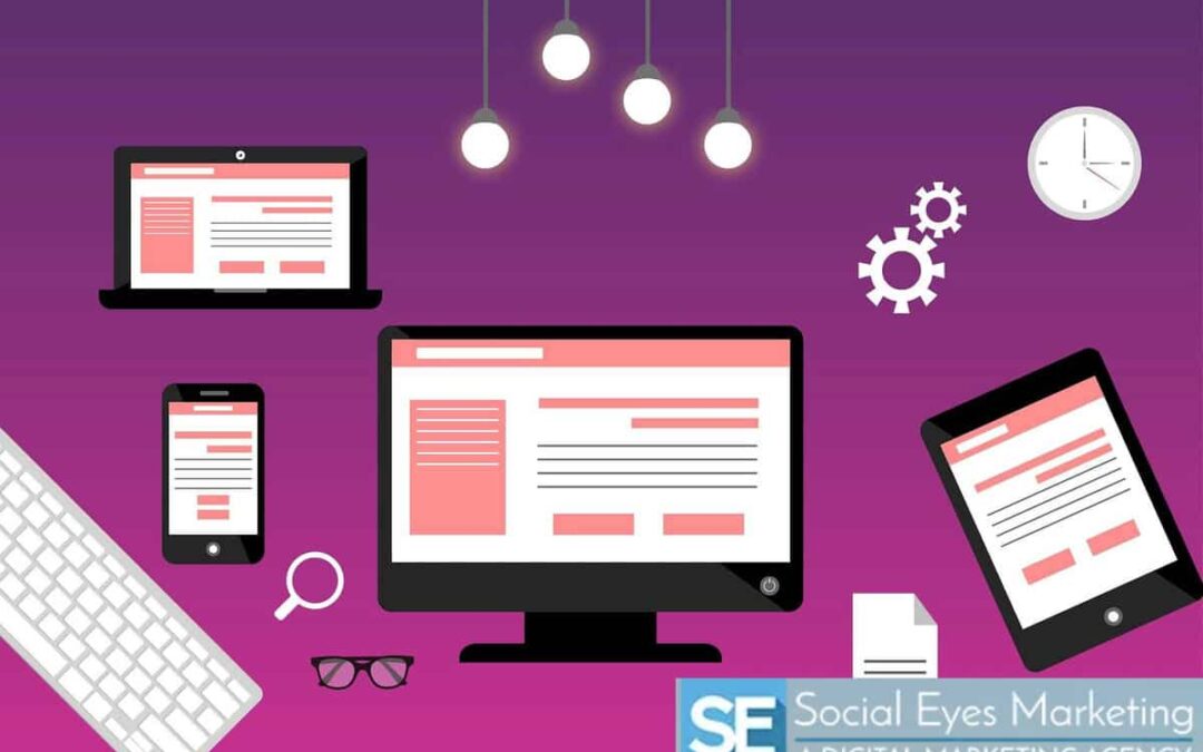
What is Responsive Web Design?
In the world of website development, there are two types of modern web design.
- Adaptive Web Design
- Responsive Web Design
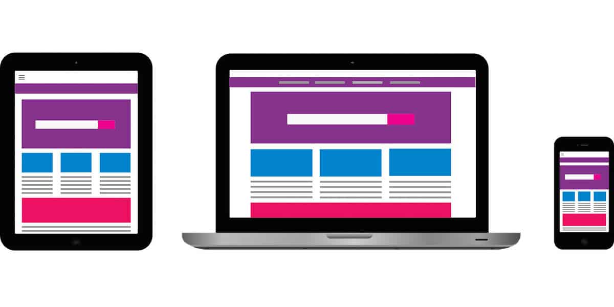
With an adaptive web design, the design layout of your website shifts between devices. Web designers choose and designate different layouts for each Individual Device in hopes to optimize the web page for specific screen sizes.
The danger of creating these fixed and separate web sites is that not all mobile devices and desktops come in a standard size. In fact, people are now accessing the internet from their TV’s – which we all know come in a variety of sizes.
If you want to optimize your website and increase your traffic, conversions and ROI, there is extreme risk in adaptive web designs. In fact, 8 out of 10 users will leave a website if it doesn’t load properly to fit their screen.
So, unless your web developer has an infinite amount of time and resources, it is impossible to format individual layouts for each device in a pleasing way, leading your users to leave your website for another one.
This is where responsive web design comes in.
Responsive web design focuses primarily on the HTML and CSS programming languages. This means that the internal coding for your web design will seamlessly adjust to whatever screen format or design it needs to optimize the content on the page.

Rather than building separate sites for each device, a responsive web design uses a single website that intelligently adjusts its layout and features based on the device being used.
How A Responsive Web Design Works
As new devices are introduced to the world, dimensions and formatting of said devices become more complicated and convoluted.
In order to help web designers keep up with the rapidly changing size and formatting of devices, HTML5 introduced the <meta>tag. This tag enables any CSS coding to automatically resize and scale an entire website to fit any screen.
For those of us who aren’t familiar with website developer coding, this simply means that within the formula that builds your website, there is an updating system that continuously optimizes your device Without The Trouble Of Redesigning And Recreating New Website Layouts With Every New Technological Invention.
This also means that Google will continue to recognize your website as contemporary and as an authority because of the relevance of your site… and you want Google on your side.
Benefits of A Responsive Web Design
The benefits of a responsive web design are pretty clear. With this universal design, you can increase your mobile traffic, improve your Google rankings, and save money on the cost of maintenance. Let’s break down each benefit to get a better understanding.
1. Future Proofing Your Website
In 2021, there were almost 15 billion mobile devices operating worldwide. By the year 2025, that number is expected to reach well over 18 billion.
That’s a lot of devices! Even more, that’s a lot of people accessing the internet (potentially, your website) in the palm of their hands.

Considering that the average household has over 10 internet connecting devices, we believe it’s safe to say that as an ecommerce business owner, the success of your business deeply depends on your website’s ability to adapt to these devices.
When using a responsive web design, new technological advancements will not be an obstacle to your business. Whatever size the viewport of a device is, by using a web developer who understands HTML and CSS coding, your website will easily flow from device to device, resizing and reformatting intuitively.
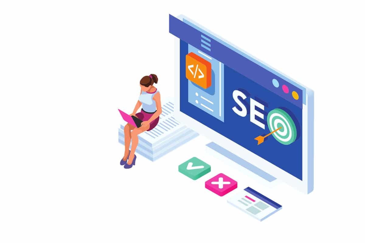
2. SEO
When a website is not optimized with a responsive web design, a mobile browser will default to desktop dimensions. When this happens, the user will have to zoom in and out and adjust themselves to the screen.
This is not user friendly and has many negative impacts on your website rankings.
In terms of building your SEO, Google recommends using a responsive web design for a multitude of reasons.
- It requires less engineering from your website developer
- Save time and resources when it comes to Googlebots crawling your site (they only need to crawl one site vs multiple individualizes sites)
- Reduces load time and therefore qualifies as a mobile friendly site
- Encourages users to stay on the site longer and read your information
Most people don’t look past Google’s first page of search results. With the millions of web pages out there, it takes time for Googlebots to be able to crawl and index each and every page.
Responsive web designs are preferred by Google, and if you design and develop your site according to Google’s needs, the chances of your page being listed on the first page will exponentially increase.
It’s hard to argue with the company that provides most of the search traffic to your site.
The combination of responsive web design and effective SEO will help Google guide your desired targeted traffic to your website.
Speaking of traffic…
3. Increased Traffic
In today’s technological environment, you could be losing more than half of your organic online traffic by having an unresponsive, fixed website that doesn’t adjust to your user’s device.
40% of people will switch to a different search result if the first one is not mobile friendly. Keep in mind that Google will register this as a bounce rate that could lower your rankings.
Google tends to favor websites that are mobile friendly and ranks them accordingly. The goal with a responsive web design is to optimize your user experience so that google ranks your website first in the search results.
A good Google ranking gets more traffic to your website, more traffic to your website means more conversions, and more conversions mean more money for you. So why not help Google rank your website by using responsive web design preferences?
4. Decreased Bounce Rate
There are many elements of a web design that affect your website bounce rate.
Slow load times are probably the number one way that websites push visitors away. In the digital age, visitors want the information they are looking for right away and waiting for a website to load is not an option.

When someone visits your website from their device, they want ease of access and consistency throughout their devices. With a responsive web design, you can ensure that your website loads quickly and is user friendly.
Because a responsive web design is already coded to fit the user’s screen, users are more apt to stick around on your site to see the information. If Google sees that people are staying on your website and clicking through instead of quickly leaving (bouncing),it will boost your rankings.
If you are noticing a high bounce rate on your site, consider hiring a professional web design and digital marketing company. They can easily help redesign and reconfigure your website into a responsive web design.
5. User Friendly
Let’s say that a user is accustomed to visiting your website via desktop.
A desktop layout with an adaptive web design will look completely different than the layout built for a mobile device or tablet. If your user is looking for a particular menu item, navigation throughout the website via mobile will feel unfamiliar and could potentially cause that user to leave your site.
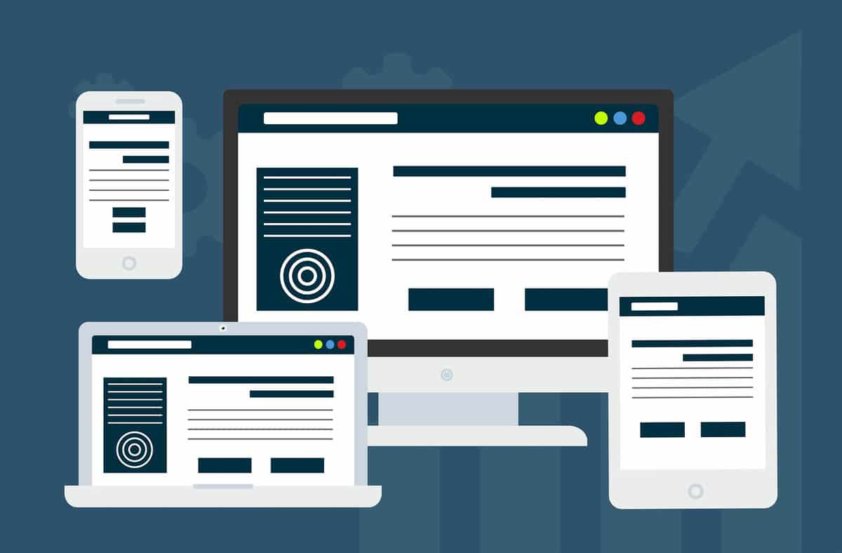
Rather than building separate sites for each device, a responsive web design uses a single website that intelligently adjusts its layout and features based on the device being used.
The content on a page seamlessly reformats to the user’s device and stays consistent and fluid throughout the user experience.
6. Social Media Marketing
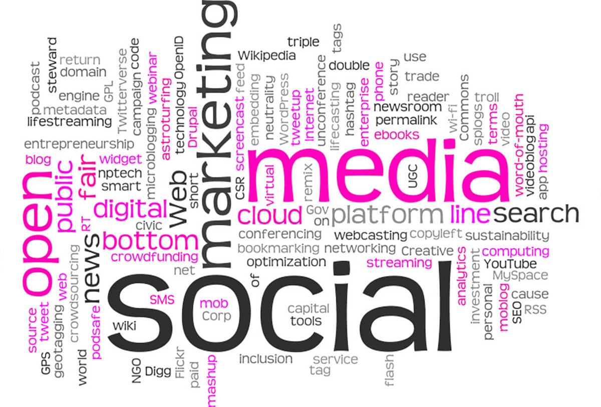
When it comes to social media, businesses are now realizing that Times have Changed. The old popular opinion about social media marketing was that it was a waste of funds with zero ROI. This is only particularly true.
Social media platforms may not be generating the actual sales, but they are a key component to your marketing strategy.
In 2022, there are now over 4.55 billion active social media users whose daily average time is about 2.5 hours. Most of these users are visiting social media platforms on their mobile device.
People expect a business to have a social media account. Without one, your business could lose credibility with future customers.
When people see your business on social media, the goal is for them to follow your links to your website. Thanks to responsive web design coding, it doesn’t matter what device the user is using- your website will load and automatically format to the user’s device preferences.
This ease of getting traffic to your website through social media can increase your ROI and conversions as long as your web design is developed properly with that responsive coding.

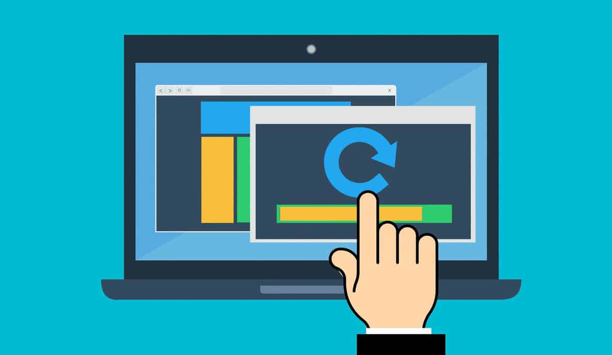
7. Easily Make Changes
With the old school adaptive format, web designers had to create at least two different websites (one for desktop and one for mobile). This means that when any updates need to be made, there are at least two websites that need to be updated separately.
This is inefficient and leaves many opportunities for mistakes and inconsistencies across devices. With a responsive web design, there is only one website to manage when any changes need to be made- saving you time and increasing your productivity.
Need a small change? The work only needs to be done once and then your web designer can move onto bigger and better things. As we stated in the beginning, if you future proof your website by starting with a responsive web design, the time it takes to make changes will be far less time consuming.
If you need help in restructuring your website, Boise’s top web design and digital marketing company Social Eyes can help you. Our professional web developers can take your current website and optimize it with responsive web design coding- getting you more traffic, more conversions, and an increased ROI.