Take a second to picture a blue bird, an apple, a swoosh, and golden arches. What do these images remind you of? Chances are that you’ve thought of Twitter, Apple, Nike, and McDonalds. But why do these simple images conjure up brands in your mind? The answer is easy, they’re good logos.
A logo represents your company. It’s the face of your brand and instantly displays the unique identity of your business. They’re anchors for your company’s branding that can create a relationship of trust with your customers. Because of this, a logo is one of the most powerful weapons that a business can have in their arsenal. With the right approach, you’ll be able to create a memorable logo design that represents your brand, but logo design isn’t as easy as it looks. With that in mind, here are our tips on how to design an outstanding logo.
The Purpose of a Logo
Before we delve into how to design a logo, it’s important to have a bit more understanding as to what a logo is. Logos are combinations of text and images that visually represent your brand and vision. A good logo should capture your attention and make a strong first impression. Plus, as the foundation of your brand identity, they are often the first thing people will remember when they think of your business.
Logos are responsible for creating brand loyalty and separating you from your competition. Consumers crave consistency and are more likely to shop with a brand they recognize than one they barely remember. Let’s say you’re shopping for a new athletic outfit, and you happen to see the Nike swoosh on a tank top. You’re already ready to purchase it based on that fact alone, even though you don’t necessarily know the size or feel of the fabric. This is because the swoosh is recognizable, and Nike is a trusted brand. You know you’ll be getting a quality product just because their logo adorns that tank top. You should strive for your logo to have this same effect.
Decide on Your Identity
Before you head to the drawing board, make sure that you know your brand intimately. A logo will be the visual face of your company, so designing it without having a deep knowledge of the brand would be like going to draw yourself without a mirror or a photo on hand. If your logo doesn’t show off at least some piece of your brand’s identity it won’t have any purpose in existing.
Consider your audience and even your competitors when designing the logo. What have your customers come to expect from you? What would you like them to see? How do you want to make your brand stand out from your competitors? Ask yourself all these questions before you even put pen to paper, and you’ll be able to have a better jumping off point to start with.
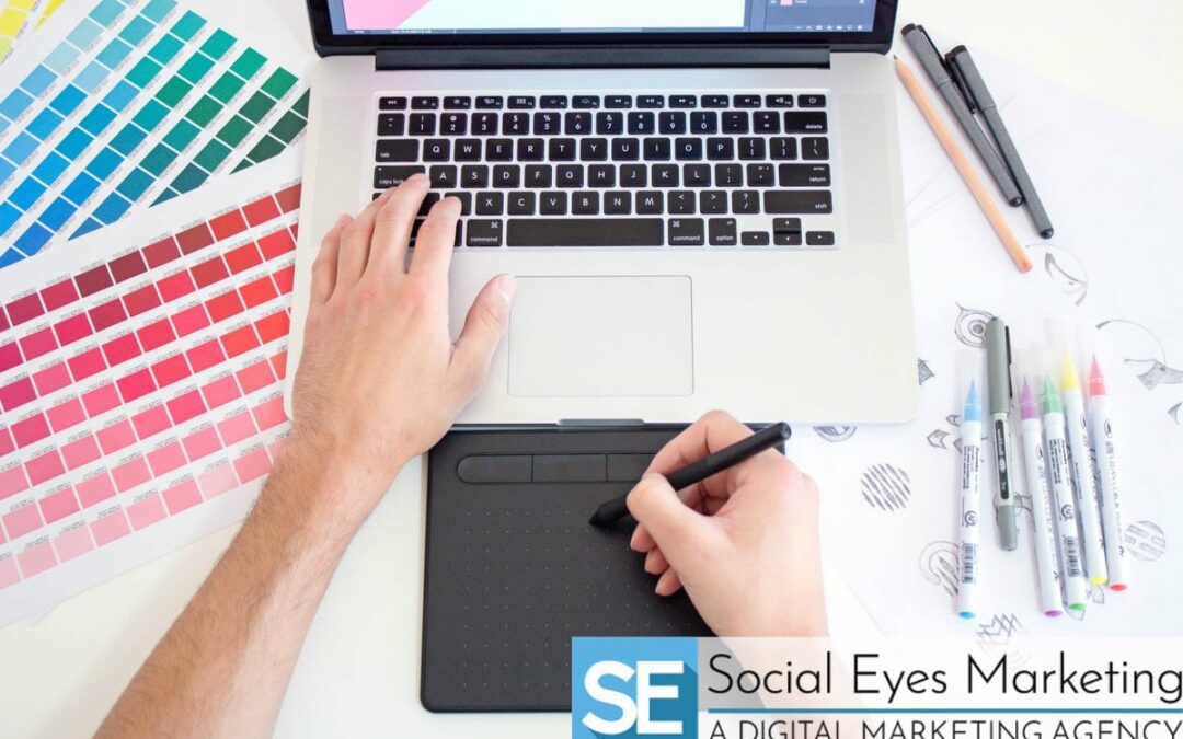
Sketch and Double Sketch
Once you have the idea of your business cemented in your head, it’s time to start designing. Get ready for your sketchbook to become your best friend as you go about sketching all the design ideas bursting in your brain. No matter how simple the idea is, make sure to jot it down. Who knows? It might end up being your top choice.
After you have a few designs sketched out go ahead and pick your favorites to start refining them. Make sure that they are unique and that they’ll stand out if ever placed in a crowd. Maybe even try and wrap some meaning into your logo design. If we look at the Apple logo, we see a simple apple with a bite taken out of it. A byte is a unit of digital information that sounds the same as the word ‘bite,’ so people enjoy the tech company’s double-meaning logo.

Simplicity Sells
As you go about designing your logo you might be tempted to cram every meaning and aspect of your brand into some facet of the design. Don’t do this. Beyond people preferring simple designs over overly complicated ones, the simpler something is, the more easily it will be recognized, the more easily it will be remembered! This concept holds true when it comes to any aspect of design, from billboards to news articles, but can be seen explicitly with the Apple logo.
In 1979 Apple had a gorgeous logo, but it was much too complicated. It was an entire piece of art that would be more suited for hanging in a frame than adorning a computer package, so it comes as no surprise that they changed it the following year. The new logo was still a bit complicated, featuring a whole rainbow of colors, but the basic design was simple enough. A few years down the road Apple decided to change their logo once again to just a silhouette. This new logo has been their standard for years since then, proving that sometimes, less is in fact more.

Design for Recall
In the previous section we mentioned that the simpler something is, the easier it will be remembered. However, you can also create memorability with a nice bit of complexity. Think about the Starbucks logo, a detailed face, two scaled tails, flowing hair, and a complex crown doesn’t scream simplicity, but it’s still recognizable. Check out the drawings of more than 150 people trying to recall the Starbucks logo from memory. Sure, they’re not perfect and there might be an octopus or two scattered in there, but for the most part people have the general design idea behind it. Perfect recognition isn’t necessary, if people can generally recall the logo, you’re all good to go!
Even if some complexity can result in a memorable logo, it is still a good idea to try and simplify your design as much as possible. Even Starbucks, with their complicated siren, has slimmed down its logo a fair bit from its original design. Keep this in mind when designing yours.

Keep Color in Mind
When designing a logo, color is one of the most important design elements you’re going to be focusing on. This is because the choice of color can draw in viewers and say something about your brand. Every color symbolizes something; blue symbolizes tranquility, green reminds us of nature, and red invokes excitement. Make sure that the colors you choose to include in your logo will represent your company correctly.
As important as color is, your logo isn’t going to be seen in all its hues of glory all the time. If it’s being printed in a newspaper, photocopied, or even included in some stationary products, it’s going to be black and white. A good logo works as well in grayscale as it does in full color, so keep this in mind when designing your logo.

It’s Not Set in Stone
You’ve gone through the entire design process and have finally settled on a logo that you love. Maybe you’ll keep that feeling forever, or maybe that ‘love’ might fade a bit to just ‘like’ in a few years’ time. Don’t worry, this is normal! All the major brands, from Nike to Coca-Cola, have had tons of logo revisions over the years. Just keep in mind that you don’t have to reinvent the wheel every time you design a new logo for yourself. Pick a facet of the design that you like and stick with it. You can see aspects of the current Coca-Cola design all the way back in the one from 1900 after all.
Work with a Designer
Logo design is one of the trickiest aspects of branding that a company can go through, so it’s always helpful to have a hand from the professionals. Working with a professional designer will ensure that you get exactly what you want from your logo, while saving you the headache that inevitably comes with any design project.
The Social Eyes design team has the expertise and know-how to create a modern logo for your business! Contact us today to get started on the journey toward your new logo!